Tagged: Wardley Mapping
A Case for Three Types of Inertia and Constraint on a Wardley Map
CONTENT WARNING: This post assumes familiarity and experience and gets into the weeds of symbols used on a Wardley Map. It may not be the easiest read if you’re new to Wardley Mapping.
On a contemporary Wardley Map, there’s typically one type of Inertia and one type of Constraint. Inertia is usually depicted inhibiting the evolutionary flow, and Constraint is usually depicted inhibiting the capital flow. While attempting to represent these in code, I ended up in a place where I now think that there are three types of Inertia and Constraint, one for each of: evolutionary flow, capital flow, and capital stock.
While working on a new Mapkeep prototype, I found that I needed to unambiguously specify how to represent Inertia and Constraints on a Wardley Map. In contemporary Wardley Mapping, an Inertia is a resistance to change that resists an evolutionary flow. It is usually depicted as solid vertical bars, typically on an evolutionary stage boundary. On the other hand, a Constraint on a Wardley Map is a constraint on a specific capital flow (link) between two stocks of capital (components). Constraint is usually depicted as a thicker connecting line between components on a map.

During the course of designing a computer representation for these, I started to consider Constraint as a sort of Inertia but on capital flow. Ultimately, this equivalence did not work out, but while thinking about it, it sparked an exploration that resulted in the three proposed types.
For a moment, assume that Constraint is the same as Inertia. What this would mean is that on a Wardley Map, when Inertia resists evolutionary flow it is called Inertia, and when Inertia resists capital flow it is called Constraint. An immediate question following this assumption is whether Inertia extends to other things on a map, which leads to the idea of Inertia on the stock of capital. This is how we end up with three types of Inertia, one for each of: evolutionary flow, capital flow, and capital stock.
Exploring the idea of three Inertias for a while resulted in consideration of the difference between Inertia and Constraint. Are they really the same? I think the relevant difference here is that Inertia can be thought of as resistance to change coming from within/internal-to a thing, whereas Constraint can be thought of as resistance to change coming from without/external-to a thing. So, with this distinction in mind, Constraint and Inertia are not the same and Constraint is not Inertia by another name.
Nevertheless, while getting some clarity on Constraint and Inertia difference, there was still the question of whether Constraint or Inertia applied to all three of: evolutionary flow, capital flow, and capital stock. And, I think they do. Here are some hypothetical examples:
- Evolutionary Flow Inertia (movement): A company with a successful product is unable to change its operating structure to pursue low margin utility evolution of the product.
- Capital Flow Inertia (links): All software system components must use AWS by default as a matter of policy and using another provider requires effort and justification.
- Capital Stock Inertia (components): A complex software subsystem that nobody knows how it works, nobody is sure where the source code is, but a lot of transactions are going through it right now.
- Evolutionary Flow Constraint (movement): Government regulation or cartel preventing a company evolving its offering into a product or utility.
- Capital Flow Constraint (links): Our website software only runs on Windows machines.
- Capital Stock Constraint (components): We have only 100 GPUs to work with.
What would they look like?

I’m thinking that if Inertia and Constraint would apply to multiple map components, then they’d have to be somewhat distinct. My current thinking is that Inertia retains its solid black bar look while Constraint looks like a caution stripe.
Is this useful? I’m not sure. Perhaps having the additional clarity on internal vs external causes of resistance may be helpful. Perhaps specifying them on a map is helpful, but not sure.
Microdoctrine: Wardley Doctrine Piece by Piece
Wardley Doctrine is a doctrine developed by Simon Wardley within Wardley Mapping.
“Doctrine are the basic universal principles that are applicable to all industries regardless of the landscape and its context.”
https://medium.com/wardleymaps/doctrine-8bb0015688e5
There is a lot of doctrine. It consists of 44 principles, many of which are entire topics onto themselves. Many writings on doctrine exist. Simon provided these under the Creative Commons Attribution-ShareAlike 4.0 International License. There are many ways to learn doctrine.
I wanted to experiment with the structure of doctrine. I hoped that I could structure it to make it easier to learn and adopt. I want to be able to assess my level of doctrine adoption. And, if I am adopting doctrine, I want to know what I should adopt next. With these goals in mind, I set out to create a doctrine format that breaks up doctrine into small pieces. I call this microdoctrine.
Microdoctrine takes inspiration from a pattern language. It organizes around the principles outlined by Simon. It breaks up those principles into specific practices for individual learning. For example:
Phase: Stop Self Harm
Category: Development
Principle: Focus On User Needs
Practice: Examine Transactions

Motivation:
Any value we create is through meeting the needs of others. A mantra of “not sucking as much as the competitors” is not acceptable. We must be the best we can be.

Consider these first:
Know Your Users

Illustrative description:
Look at the transactions that an organisation makes with the outside world. Examine the customer journey when interacting with those transactions.

Detailed description:
Look at the transactions that an organisation makes with the outside world. This will tend to give you an idea of what it provides and what is important. Next, examine the customer journey when interacting with those transactions. Question this journey and talk with customers. You will often find pointless steps or unmet needs or unnecessary needs.

Another mechanism, if you adopted Wardley Mapping, is to map out the user’s landscape. By mapping out their landscape, you can often clarify what the user needs. You can also find entire new opportunities for business.

STOP READING, TAKE ACTION
Consider next:Align Value Generation With User Needs or Consider Stage of Evolution
“Consider these first” and “Consider next” links express sequencing. This is to answer what principle to adopt next. This also intends to provide immediate benefit. At the same time, it intends to build up ability to adopt future practices.
I completed the first nine doctrine principles in microdoctrine format. These make up Phase I: Stop Self Harm. They are all listed on the Wardley Mapping community site. The starting place is Phase I : Development : Know Your Users.
I can imagine us, doctrine practitioners, organizing around the microdoctrine structure. Each of us could contribute our specific expertise. For example, Phase I : Communication : Challenge Assumptions practices all deal with Spend Control. An expert on Cynefin could contribute a Phase I : Communication : Challenge Assumptions : Ritual Dissent practice for us to consider. My hope is that microdoctrine provides minimal scaffolding for us to organize around.
What do you think? Is this structure useful for learning or assessing doctrine? Are the existing patterns valid? Do you want to add patterns you know about?
Introducing Phase Line Mapping
TL;DR Phase Line Mapping is like Wardley Mapping, but at a smaller scale, the scale of projects or initiatives. Instead of the evolution axis, we have a phase line completion axis.
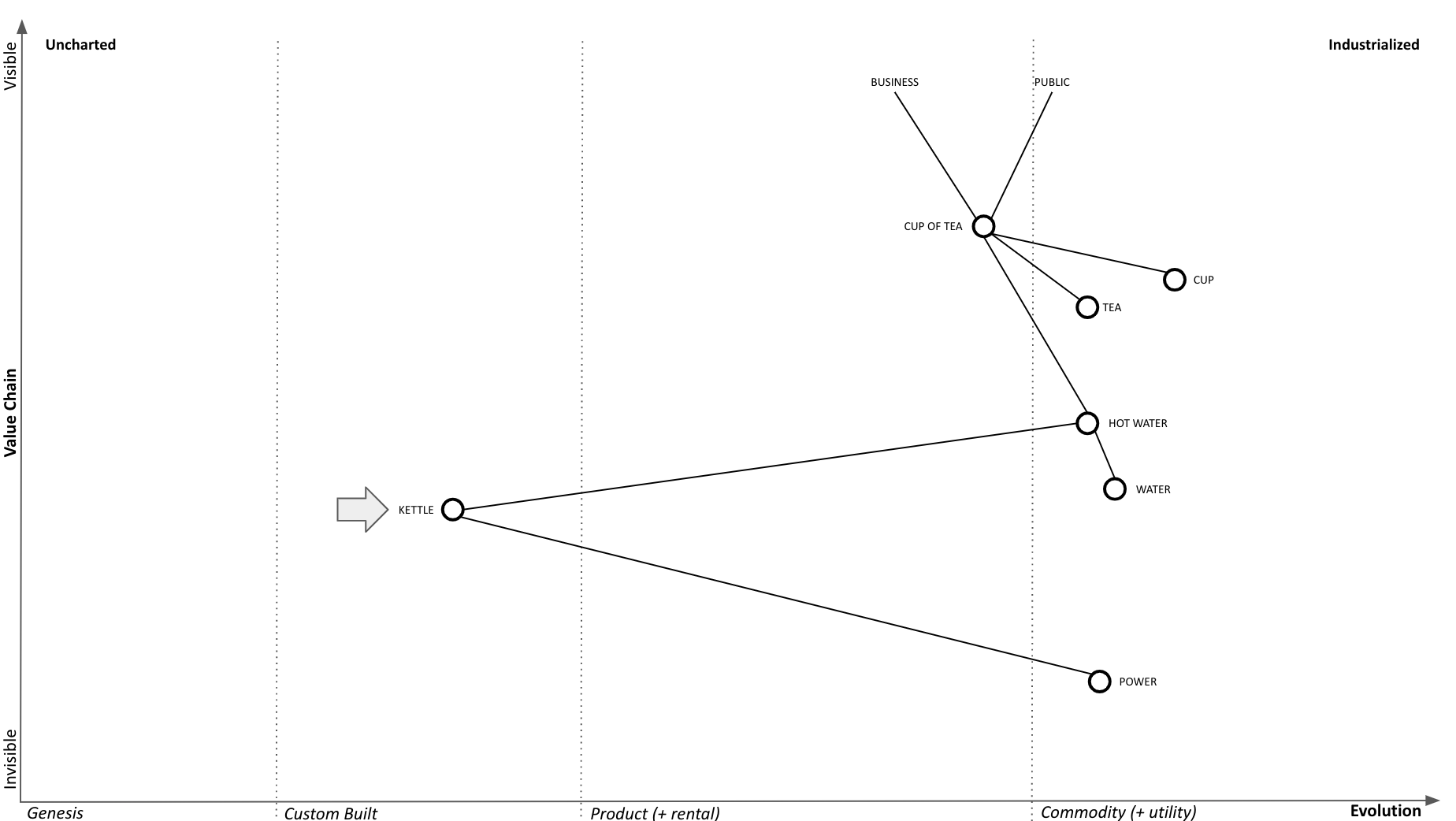
Phase Line Mapping attempts to bring topographical intelligence to project management, similarly as to how Wardley Mapping brought topographical intelligence to business strategy. Taking the classic tea shop Wardley Map, let’s assume we decided to replace the custom kettles we’re building with a supply of commodity kettles.
Phase Line Mapping
A phase line is a synchronization mechanism that is similar to a milestone but different from a due date. It depicts changes in the phase of an operation without using dates, therefore, making it possible to coordinate without coupling to the calendar.
Phase Line Mapping retains the value chain scaffolding as the y-axis, in order to keep the project anchored to the outcome it is supposed to provide, while substituting phase line completion axis for the evolution axis:

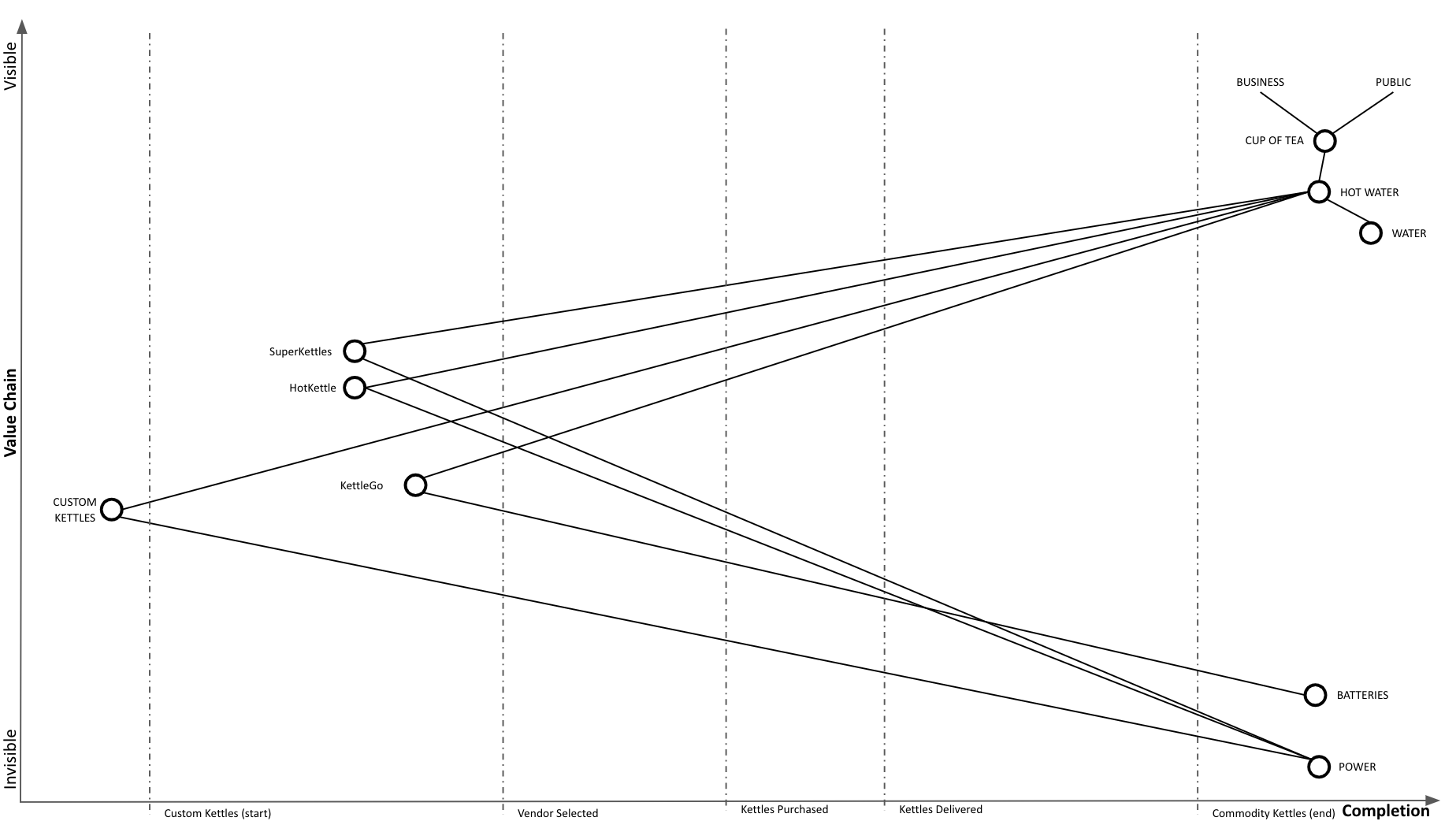
We conduct vendor selection by trying out a few vendors (SuperKettles, HotKettle, and battery powered KettleGo):
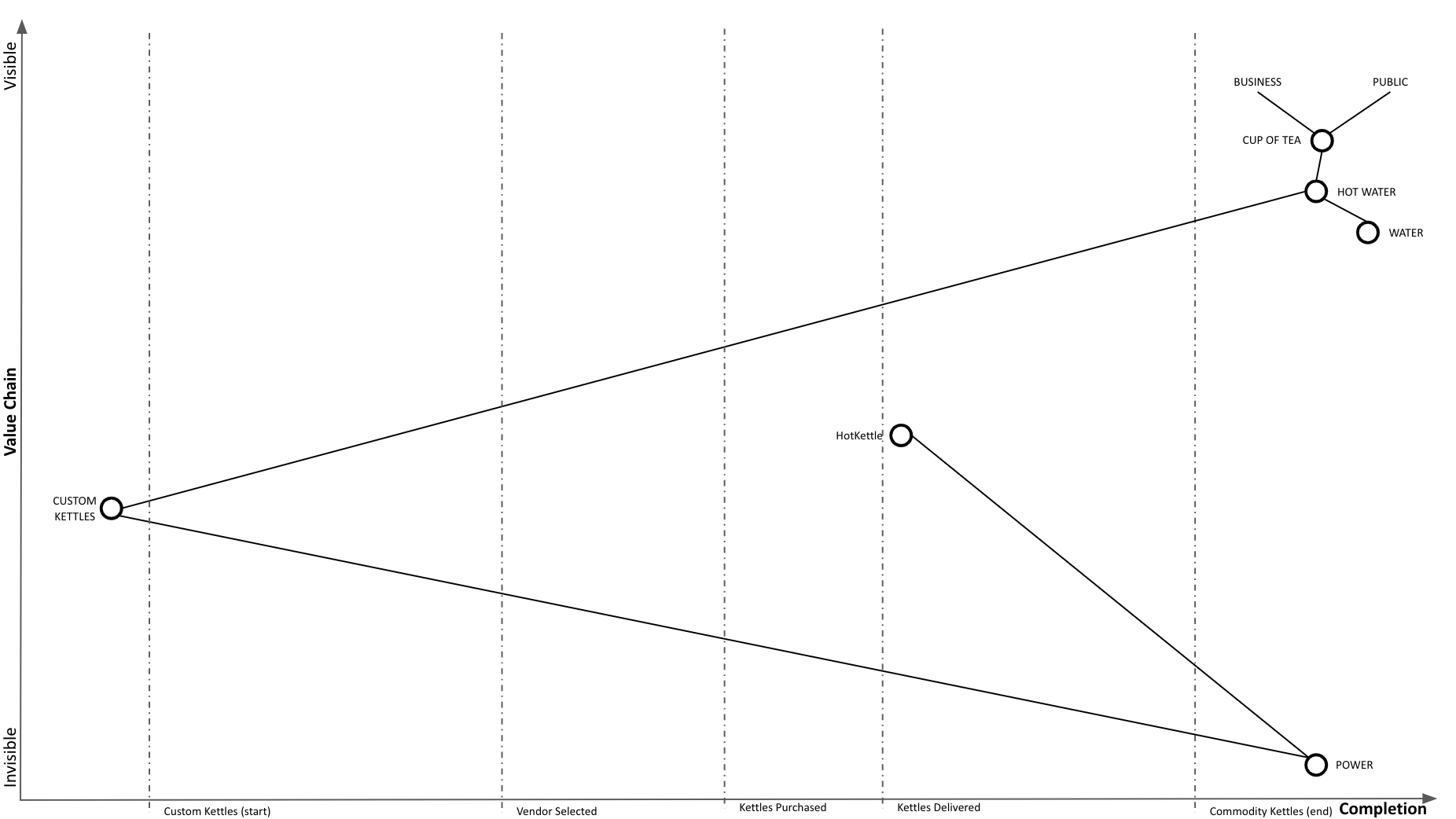
We determined that HotKettle has the right stuff and select them as our vendor. We go through the purchasing process. Notice that we continue to use our custom kettles throughout:

We are hitting some snags with purchasing, but we’re almost there:

Purchasing complete, awaiting delivery:

New HotKettle kettles delivered:
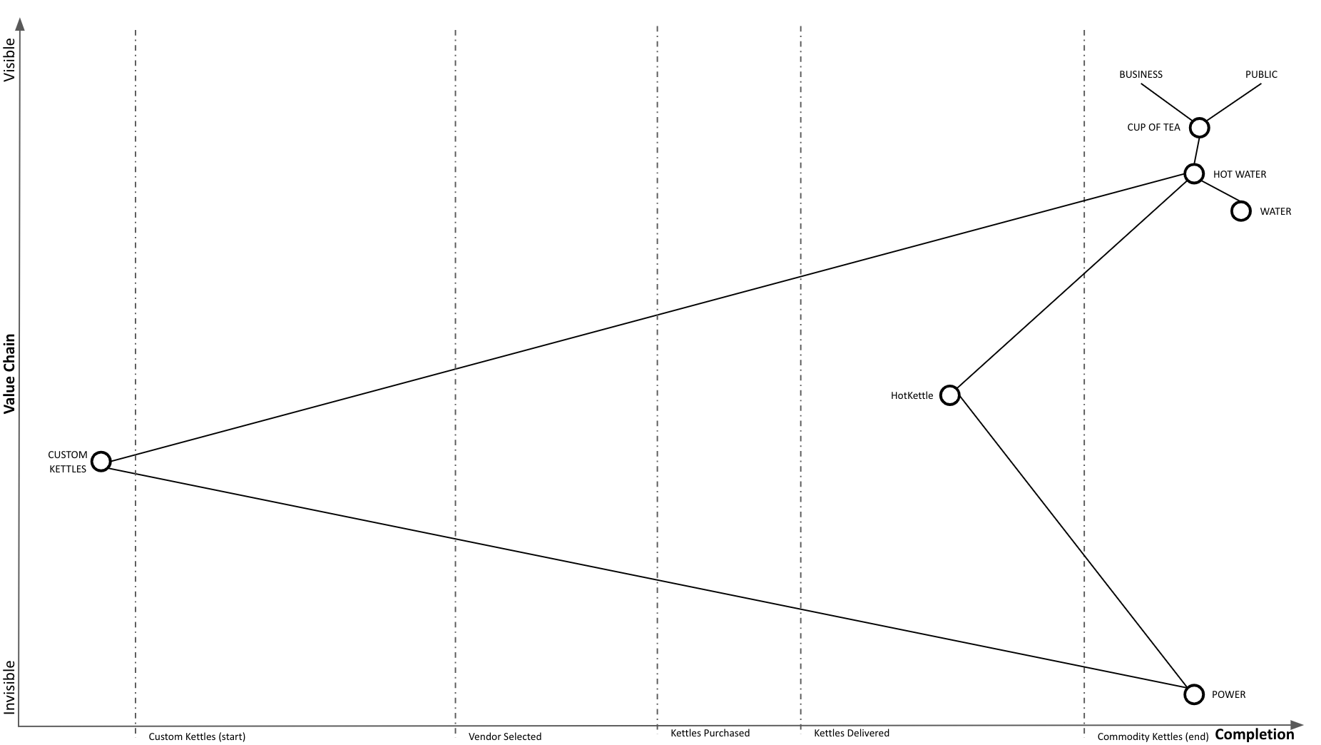
We started our replacement in-place process and are now using HotKettles as well as custom kettles:
Our adoption of HotKettles is complete:
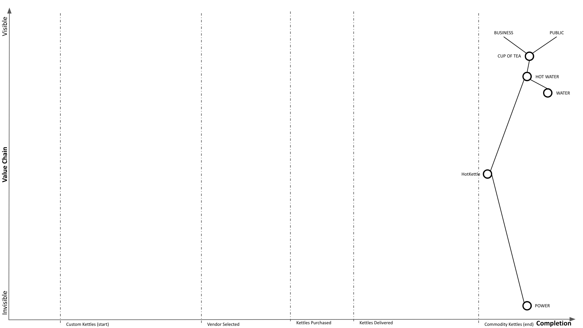
And at Wardley Mapping scale, we completed our transition to commodity:

Phase Line Mapping retains the required elements of a basic map. It is visual, context specific, position has meaning, it is anchored in user needs, movement is present (across phase lines, instead of evolution), and it has components.
Phase Line Mapping has at least two of the three elements of an advanced map. It demonstrates flow between components and can represent different types of things. I am uncertain about what the project level climate looks like or if a stable climate exists. That remains to be seen.
Why?
I have made multiple attempts to share Wardley Mapping. Wardley Maps were intuitive and obvious to me (once I saw them), due to my life experience with topographical maps. However, my experience is not a shared context, and I found it difficult to communicate the value to someone who didn’t immediately “get it”.
The thinking with Phase Line Mapping is that many organizations are executing many projects and programs and are communicating progress in multiple custom ways. Phase Line Mapping is yet another (custom) way to demonstrate project progress across milestones. However, the hope here is to demonstrate mapping that is coherent with Wardley Mapping (same elements, things still move to the right), but where the feedback cycle is much quicker than your typical Wardley Map time scale. It can take years for things to move on a Wardley Map. By introducing a phase line axis, we can generate more feedback loops quicker while training people in Wardley Map intuitions.
My hope is that by being able to demonstrate Phase Line Mapping more broadly in projects, perhaps then, it will be easier to introduce a Wardley Map by saying: it’s like Phase Line Mapping, but at a larger scale, the scale of business. Instead of the phase line completion axis, we have an evolution axis.
