Tagged: Wardley Maps
The Next Monty 3D Environment Simulator
This is an overview of the state of Monty’s 3D environment simulators as of December, 2024. It discusses existing constraints and highlights where contributions would be particularly helpful.
For those unfamiliar with Monty, it is an open-source sensorimotor learning framework based on the Thousand Brains Theory of the neocortex. For more information on the overall project, see the Thousand Brains Project Documentation.
At a high level, the Monty framework consists of an experiment which coordinates the flow of data between Monty and a simulated environment.
As a sensorimotor learning system, Monty continuously generates motor output during training and inference. The simulated environment processes this motor output and provides sensory input back to Monty.
The following Wardley Map depicts Monty’s general dependency on simulators. If Wardley Maps are new, just ignore the special symbols and the Evolution axis.

Specifically, as of December, 2024, Monty depends on the Habitat Sim simulator.

The Habitat Sim version that Monty depends on is version 0.2.2. The latest available version is 0.3.2.

We’ll return to Habitat Sim shortly, but first, a quick digression on the state of Python version support as of December, 2024.

Depicted are the Python versions from 3.8 through 3.14. The version 3.8 is now obsolete and, as a result, shown in the Custom stage of Evolution. Versions 3.9 through 3.13 are actively supported and shown in the Commodity stage of Evolution. The 3.14 version is in development and will be released in October, 2025, when it will enter the Commodity stage of Evolution. Lastly, version 3.9 is shown becoming obsolete and entering the Custom stage in October, 2025.1
Back to Habitat Sim, it is noteworthy to highlight a dependency constraint between the Habitat Sim versions and the Python versions. The Habitat Sim version 0.2.2 is coupled to the Python 3.8 Application Binary Interface (ABI). The latest Habitat Sim version 0.3.2, is coupled to the Python 3.9 ABI. These constraints are depicted in the figure below.

In summary, Monty depends on Habitat Sim for a simulated environment. The version of Habitat Sim used by Monty depends on an obsolete Python version 3.8. Upgrading to the latest Habitat Sim version will couple Monty to Python 3.9, which will be obsolete in October, 2025.
There is interest from the Thousand Brains Project community to run Monty on Windows OS. This is challenging because Habitat Sim does not run on Windows OS. Additionally, Monty code has unintentional coupling to Habitat Sim that effectively limits viable operating systems on which Monty runs to Linux and Mac OS.
While the work to remove the unintentional coupling to Habitat Sim is ongoing, even with the coupling removed, there is no example of support for a simulator that runs on Windows OS.
I believe it is time to consider a simulator that runs on Windows OS and does not limit Monty to the oldest Python versions.
Some available simulators are listed in the figure below: PyBullet, MuJoCo, Webots, Unreal Engine, NVIDIA Isaac Sim, Unity.

Of additional note is the Robot Operating System (ROS) which can serve as a common interface to some of the simulators listed.

Among these options, I think MuJoCo is the most promising to evaluate. As I don’t have direct experience with it, any knowledgeable advice or guidance will be helpful. If you want to take the lead, I can contribute to a Request For Comments (RFC) where we’d get into evaluation and integration details. A prototype implementation would also be helpful.
If you think Monty should support a different simulator, that will be helpful as well. Supporting more than one simulator will serve as a forcing function to ensure no unintentional coupling
- Status of Python versions. Python Developer’s Guide. Retrieved December 8, 2024, from https://devguide.python.org/versions/ ↩︎
A Case for Three Types of Inertia and Constraint on a Wardley Map
CONTENT WARNING: This post assumes familiarity and experience and gets into the weeds of symbols used on a Wardley Map. It may not be the easiest read if you’re new to Wardley Mapping.
On a contemporary Wardley Map, there’s typically one type of Inertia and one type of Constraint. Inertia is usually depicted inhibiting the evolutionary flow, and Constraint is usually depicted inhibiting the capital flow. While attempting to represent these in code, I ended up in a place where I now think that there are three types of Inertia and Constraint, one for each of: evolutionary flow, capital flow, and capital stock.
While working on a new Mapkeep prototype, I found that I needed to unambiguously specify how to represent Inertia and Constraints on a Wardley Map. In contemporary Wardley Mapping, an Inertia is a resistance to change that resists an evolutionary flow. It is usually depicted as solid vertical bars, typically on an evolutionary stage boundary. On the other hand, a Constraint on a Wardley Map is a constraint on a specific capital flow (link) between two stocks of capital (components). Constraint is usually depicted as a thicker connecting line between components on a map.

During the course of designing a computer representation for these, I started to consider Constraint as a sort of Inertia but on capital flow. Ultimately, this equivalence did not work out, but while thinking about it, it sparked an exploration that resulted in the three proposed types.
For a moment, assume that Constraint is the same as Inertia. What this would mean is that on a Wardley Map, when Inertia resists evolutionary flow it is called Inertia, and when Inertia resists capital flow it is called Constraint. An immediate question following this assumption is whether Inertia extends to other things on a map, which leads to the idea of Inertia on the stock of capital. This is how we end up with three types of Inertia, one for each of: evolutionary flow, capital flow, and capital stock.
Exploring the idea of three Inertias for a while resulted in consideration of the difference between Inertia and Constraint. Are they really the same? I think the relevant difference here is that Inertia can be thought of as resistance to change coming from within/internal-to a thing, whereas Constraint can be thought of as resistance to change coming from without/external-to a thing. So, with this distinction in mind, Constraint and Inertia are not the same and Constraint is not Inertia by another name.
Nevertheless, while getting some clarity on Constraint and Inertia difference, there was still the question of whether Constraint or Inertia applied to all three of: evolutionary flow, capital flow, and capital stock. And, I think they do. Here are some hypothetical examples:
- Evolutionary Flow Inertia (movement): A company with a successful product is unable to change its operating structure to pursue low margin utility evolution of the product.
- Capital Flow Inertia (links): All software system components must use AWS by default as a matter of policy and using another provider requires effort and justification.
- Capital Stock Inertia (components): A complex software subsystem that nobody knows how it works, nobody is sure where the source code is, but a lot of transactions are going through it right now.
- Evolutionary Flow Constraint (movement): Government regulation or cartel preventing a company evolving its offering into a product or utility.
- Capital Flow Constraint (links): Our website software only runs on Windows machines.
- Capital Stock Constraint (components): We have only 100 GPUs to work with.
What would they look like?

I’m thinking that if Inertia and Constraint would apply to multiple map components, then they’d have to be somewhat distinct. My current thinking is that Inertia retains its solid black bar look while Constraint looks like a caution stripe.
Is this useful? I’m not sure. Perhaps having the additional clarity on internal vs external causes of resistance may be helpful. Perhaps specifying them on a map is helpful, but not sure.
The Wardley Graph
A Non-Euclidean Wardley Map Embedding In Semantic Spacetime
Every Wardley mapper quickly learns the difference between graphs and maps: the space on a map has meaning, whereas space on a graph has none. Another way of framing this is that a Wardley Map is a Euclidean embedding (information is projected onto a Euclidean space, a vertical and horizontal axis). A graph is a non-Euclidean embedding (information content is in the vertices and edges and attributes of the graph).
Euclidean embedding is an excellent interface for people as it is optimized for human visual processing of information. For Wardley Map tool builders, the Euclidean embedding is typically represented in a machine as x and y coordinates. I intend to demonstrate below that a non-Euclidean Wardley Map embedding in a semantic spacetime (a Wardley Graph) seems to be a better machine representation for Wardley Maps tooling.
Semantic Spacetime
Mark Burgess explains the nature of semantic spacetime in his book: “Smart Spacetime: How Information Challenges our Ideas About Space, Time, and Process”, but the key inspiration for this post is his Universal Data Analytics as Semantic Spacetime series on Medium. Below, I very quickly summarize the portion relevant to understanding what follows.
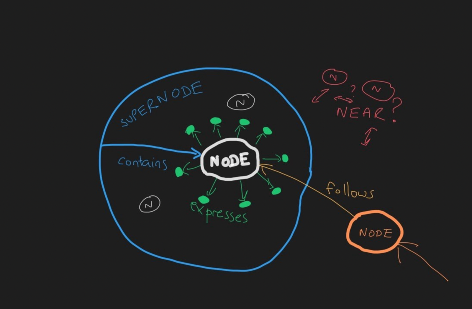
Within semantic spacetime, there exist four meta-types of semantic links, which describe process causal structure. That is, there are, fundamentally, only four kinds of relationships:
- CONTAINS (where A contains B) – a container/space-like relationship; to be inside or outside (part of); math analogy is a polar vector
- FOLLOWS (where A follows B) – a sequential/time-like relationship; to follow or precede; math analogy is a translation vector
- EXPRESSES (where A expresses B) – a local property being expressed; to express information; math analogy is a scalar property
- NEAR (where A is near B) – a similarity/nearness relationship; to be next to another location; math analogy is a primitive vector
Each one of the above types can be expressed in four directions:
- Forward – e.g.: “Contains”
- Backward – e.g.: “Is Contained By”
- Negative-Forward – e.g.: “Does Not Contain”
- Negative-Backward – e.g.: “Is Not Contained By”
A table description may be helpful:
| Meta-Type | Forward | Backward | Negative Forward | Negative Backward |
| CONTAINS | Contains | Constitutes | Does not Contain | Does not Constitute |
| FOLLOWS | Follows | Precedes | Does not Follow | Does not Precede |
| EXPRESSES | Expresses | Describes | Does not Express | Does not Describe |
| NEAR | Near | Near | Not Near | Not Near |
And in an illustration form:
For specific instances of a link, we would add a specific type to the meta-type. For example: “Is Like” (NEAR), “After” (FOLLOWS), “Depends On” (FOLLOWS), etc.
Examples and intuition regarding specific types1:

With this understanding of semantic spacetime, how do we embed a Wardley Map in it?
The Vertical Axis
The information contained within a Wardley Map vertical axis traditionally represents the value chain. Relative position is the primary information content and is typically modeled by a dependency graph. The semantic link type of the dependencies between components in a value chain is “depends on” (FOLLOWS).
The semantics appear to change near the customer, as the customer expresses a user need (such as “thirst”). The semantic link type of the value chain dependency between a customer and the user need is “expresses” (EXPRESSES).
What then, is the elementary type of link between the user need and the component that fulfills that need? It is another type of FOLLOWS, specifically “fulfilled by” (FOLLOWS).
Visually:
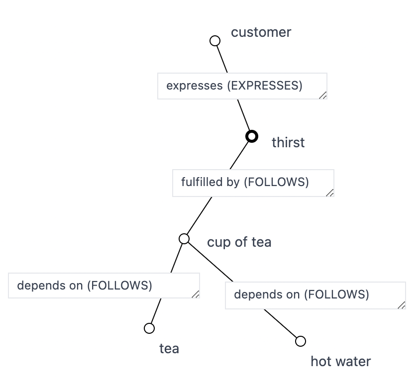
Within the value stream context, it is of note that the customer/user need/offering is only modeled at the edge of the map near the customer anchor (expresses (EXPRESSES) + fulfilled by (FOLLOWS)) and not modeled in the dependency chain of the value stream (all of the “depends on” (FOLLOWS) links). If we consider what needs to happen for the cup of tea component to instantiate, we see that a cup of tea EXPRESSES the need for tea and hot water, and those have to be “fulfilled by” (FOLLOWS) the tea and hot water components.
From this, we can see that a “depends on” (FOLLOWS) link is an aggregate of a component “expressing” (EXPRESSES) a user need which is “fulfilled by” (FOLLOWS) an offering fulfilling the need. That is, if we “zoom in” on a “depends on” (FOLLOWS) link we observe a user need appear surrounded by “expressing” (EXPRESSES) and “fulfilled by” (FOLLOWS) links. For example, “zooming in” into the link between cup of tea and tea:

Again, we typically don’t “zoom in” like this on a map, but my intent here is to demonstrate a certain equivalence present between semantic links in the value chain once they are projected into semantic spacetime.
Just Scaffolding
Simon Wardley often points out that the vertical position on a Wardley Map is “just scaffolding”. Having seen it now from the semantic spacetime framing, this may be due to all of the information being contained in the graph links, that is, the relative non-Euclidean position with respect to the other nodes. The Wardley Graph directly represents the Wardley Map value chain as nodes and edges.
Horizontal Axis
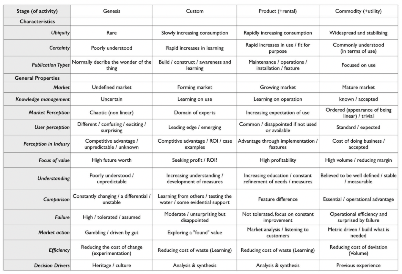
The horizontal-axis of a Wardley Map traditionally maps to the stages of evolution2. In order to determine the horizontal coordinate, the stages of evolution cheat sheet offers qualitative guidance:
For a machine, rather than storing an x coordinate between 0 and 1, it is more effective to retain the specific semantic links to each of the qualitative properties.
I explored machine encoding of the horizontal axis in https://mappingevolution.com, where I collected human (Euclidean projected) input in response to prompts for selecting how NEAR a component under consideration is to each characteristic of each evolutionary stage. This input was then interpreted as a four-dimensional vector with a weight assigned to each stage of evolution. The resultant four-dimensional vector was a summary of an underlying graph of relationships and allowed for aggregation across multiple summaries.
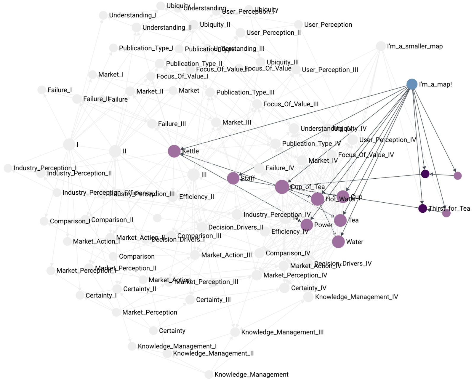
In order to retain the semantic spacetime graph, the approach here is to create a graph between the component and each characteristic in each evolutionary stage using EXPRESSES links. Visually, it looks something like this:
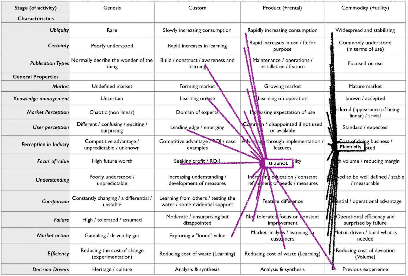
We can retain the meaning of a component being in the Product stage by having most of its links EXPRESS a characteristic that is CONTAINED by the Product stage. Similarly, a component with all links EXPRESSING characteristics CONTAINED by the Commodity stage would correspond to being a Commodity.
This graph representation retains the ability to aggregate multiple summaries by assigning weight to each EXPRESS link based on the count of its occurrences in the individual samples being aggregated.
Additional benefit is that there is no forcing of position in Euclidean space. If an EXPRESS link exists, it contributes to how much Product-ness is being EXPRESSED by the component. If the link does not exist, it has no effect.
This graph representation also enables a graph algorithm for summarizing an entire Wardley Map into a single component (described later).
Characteristics and General Properties Themselves
The characteristics and general properties of the stages of evolution themselves, instead of a table in the illustration above, can also be expressed as a graph. For example, the general property of Failure at each stage: tolerated, disappointed, not tolerated, surprised has bidirectional NEAR links between the stages:
tolerated is NEAR disappointed
disappointed is NEAR not tolerated
not tolerated is NEAR surprised
Notice that these are not transitive in the sense that Failure being tolerated is not NEAR being surprised by Failure. In general, Genesis is NEAR Custom, which is NEAR Product, which is NEAR Commodity.
Aside from the bidirectional NEAR links, there also exist unidirectional (“evolved from”) FOLLOWS links:
disappointed FOLLOWS tolerated
not tolerated FOLLOWS disappointed
surprised FOLLOWS not tolerated
(and in the case of Obsolescence Climatic Pattern3)
not tolerated FOLLOWS surprised
disappointed FOLLOWS not tolerated
In general, Genesis is FOLLOWED by Custom, which is FOLLOWED by Product, which is FOLLOWED by Commodity, (and in the case of Obsolescence Climatic Pattern) which is FOLLOWED by Product, which is FOLLOWED by Custom.
In the context of Obsolescence Climatic Pattern, there are interesting differences in characteristics expressed by a component in Custom at the beginning of its existence when compared to being in Custom at the end of its existence.
Recovering the Horizontal Axis
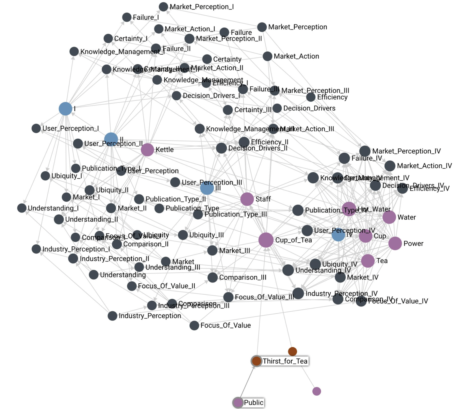
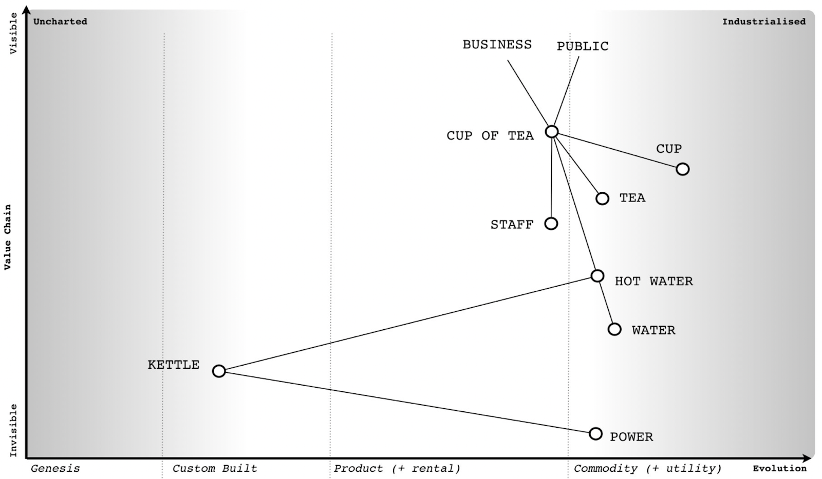
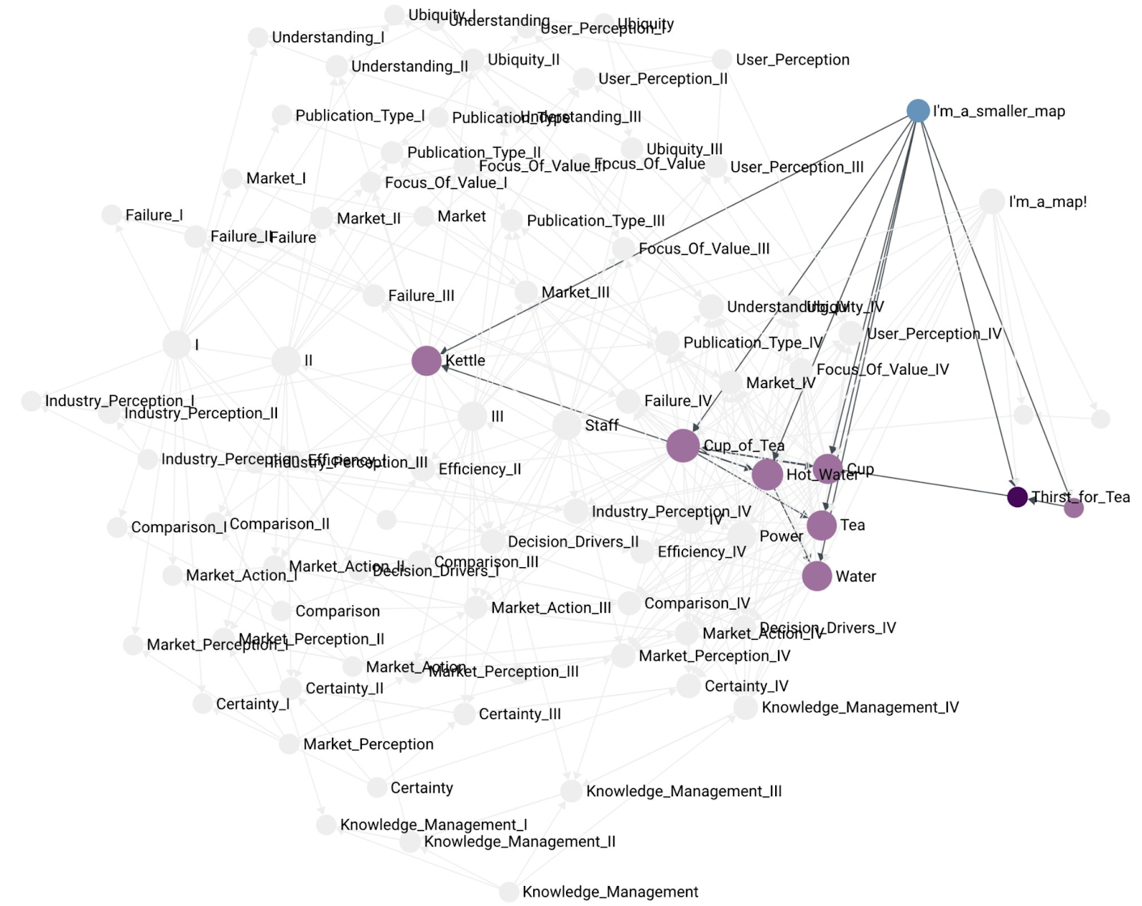
The idea of the Wardley Graph is to maintain a graph machine representation for a Wardley Map. This means we need to be able to recover a Wardley Map from a Wardley Graph. For a demonstration, let’s consider the classic Cup of Tea map:
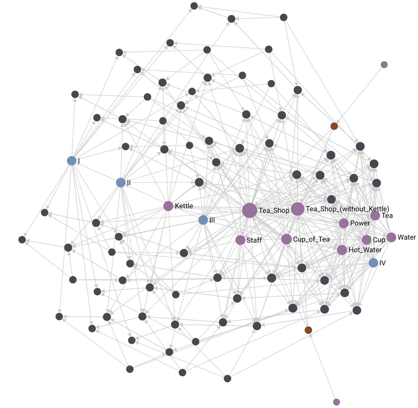
With the Cup of Tea map encoded as a Wardley Graph, we can project it onto Euclidean space, and we see something like this:
First, this is clearly not a Wardley Map. The idea here is to demonstrate that the essential information that we typically extract from the horizontal axis position is present in the graph links. The projection above is done using force-directed graph drawing. Notice the presence of stages of evolution I, II, III, and IV and imagine the horizontal axis aligned along that sequence of nodes. We see that where each component is located ends up corresponding to where it is present on the original Wardley Map. This means that the graph alone contains enough information to reconstruct the horizontal axis coordinate from the graph information alone.
Another thing of note is the location of the customers expressing user needs (Public and Thirst for Tea are highlighted in the picture). I often experience a lot of anxiety of where to place the customer on the evolutionary axis. Within the Wardley Mapping community, there are also methods that depict the customer using different horizontal labels, or even a completely different coordinate system like the user journey. The Wardley Graph encoding can demonstrate that customers and user needs are a boundary condition and do not need to be associated with stages of evolution to be useful.
Movement
Components Move
Throughout the stages of a component’s evolution, the component updates the EXPRESSES links between itself and the various stages of each evolutionary characteristic. The aggregation of these links viewed at different times changes as the component EXPRESSES more characteristics CONTAINED by one stage of evolution vs another (Genesis, Custom, Product, or Commodity). When these snapshots are viewed over time, an effect corresponding to what we label as “movement” occurs.
This same movement occurs on the Wardley Graph:
If you’re having trouble seeing the similarity, consider this visualization showing the same movement as the videos above, but this time on a Wardley Graph with nodes arranged in the familiar grid pattern:
Moving Components
One of the uses of Wardley Maps is to determine what actions to take where on the map. One of those actions may be to accelerate a component along its evolutionary trajectory. In order to move a component in semantic spacetime towards a more desired state of evolution, we can evaluate each characteristic and focus on the component EXPRESSING a different characteristic through our actions in the world. For example, increasing components ubiquity by switching to mass manufacturing methods.
This framing highlights that some characteristics may be actionable/controllable/leading (switch from experimental investment to searching for profit), while others may be unactionable/lagging (user perception, market perception).
Jabe Bloom (@cyetain) points out that “movement is not free”, therefore, affecting component characteristics requires action that expends time and treasure. Chris Daniel (@wardleymaps) points out that some moves are too expensive to make: “toxic legacy”, therefore, some changes in characteristics may be completely out of reach.
Summary/Aggregation
So, we have a Wardley Graph, what is the benefit?
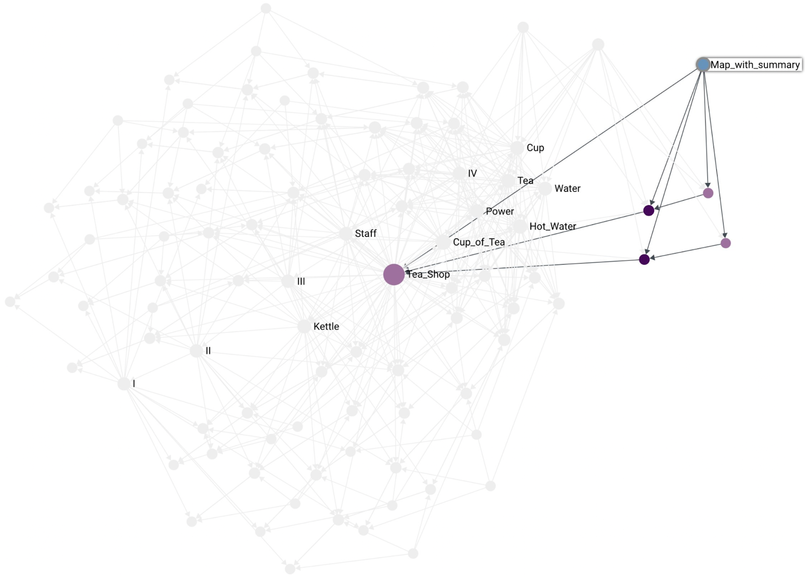
One of the problems that machines need to deal with that humans do automatically is summary and aggregation of components on Wardley Maps. On the Cup of Tea map there is a Power component. This is fairly abstract, but if needed, we could replace the Power component with wall socket, breakers, panels, wires, power stations, etc. In machine representation, we need to be able to do something similar, and this is where Wardley Graph machine representation is really useful.
Instead of saying this is possible in the abstract, we can instead define a graph algorithm for Wardley Map component summary based on Mark Burgess’ algorithm for grouping nodes into supernodes4. The algorithm below is written in terms of summarizing all map components (excluding user needs and customers), but works just the same for summarizing only a subset of map components.
- Map components are all marked under a single “hub” component (the summary component for the map). All the map components are linked to the hub with a CONTAINS link, specifically “Is contained by” (CONTAINS).
- Aggregate information about each map component is aggregated into the hub component. This information is:
- Total count of map components (aggregated from existing counts if map consists of hub components already).
- Any other scalar-like property of the nodes, ex: EXPRESS links summed up and tallied
- Consider other graph machine learning node features. For example, a Graphlet Degree Vector (GDV) could express the particular way that components express evolutionary characteristics. The specific graphlet count could indicate how many characteristics are expressed by the component.
- Links from summarized components to things that are outside of the hub are copied to the hub component. Repeated links are summed and represented as link weight.
- For information encoded in the vertical axis (value chain), the hub component does not include user needs and customers, those remain outside of the hub.
- For information encoded in the horizontal axis (evolution), all of the component EXPRESS links designating their stage of evolution are aggregated and summed as link weights at the hub level, thus determining the hub’s summary stage of evolution.
As a result of the above algorithm, the hub becomes a single component, ready to answer queries, and can be used as a component of another map, thus expressing the fractal nature of Wardley Map components. For example, the above algorithm can generate a summary Tea Shop component for the entire Cup of Tea map. Note in the illustration below that the Tea Shop ends up projecting into space where you’d expect it to. Also note that the summary of Tea Shop (without Kettle) is also where you’d expect it to be.
With the Tea Shop, we have an example of summarizing many components into a single summary component. Another use for the summary algorithm is to integrate multiple points of view of the same component, a version of crowdsourcing. Multiple people (and machines) can determine characteristics expressed by some component. The summary algorithm can then integrate all those points of view and provide a crowdsourced version of the component. This is another powerful collaboration feature enabled by the Wardley Graph.
Another benefit of automated summary are component updates. When a constituent component is updated, the summary and anything else connected can be updated automatically as well.
What is a Map?
How should maps be represented on the Wardley Graph?
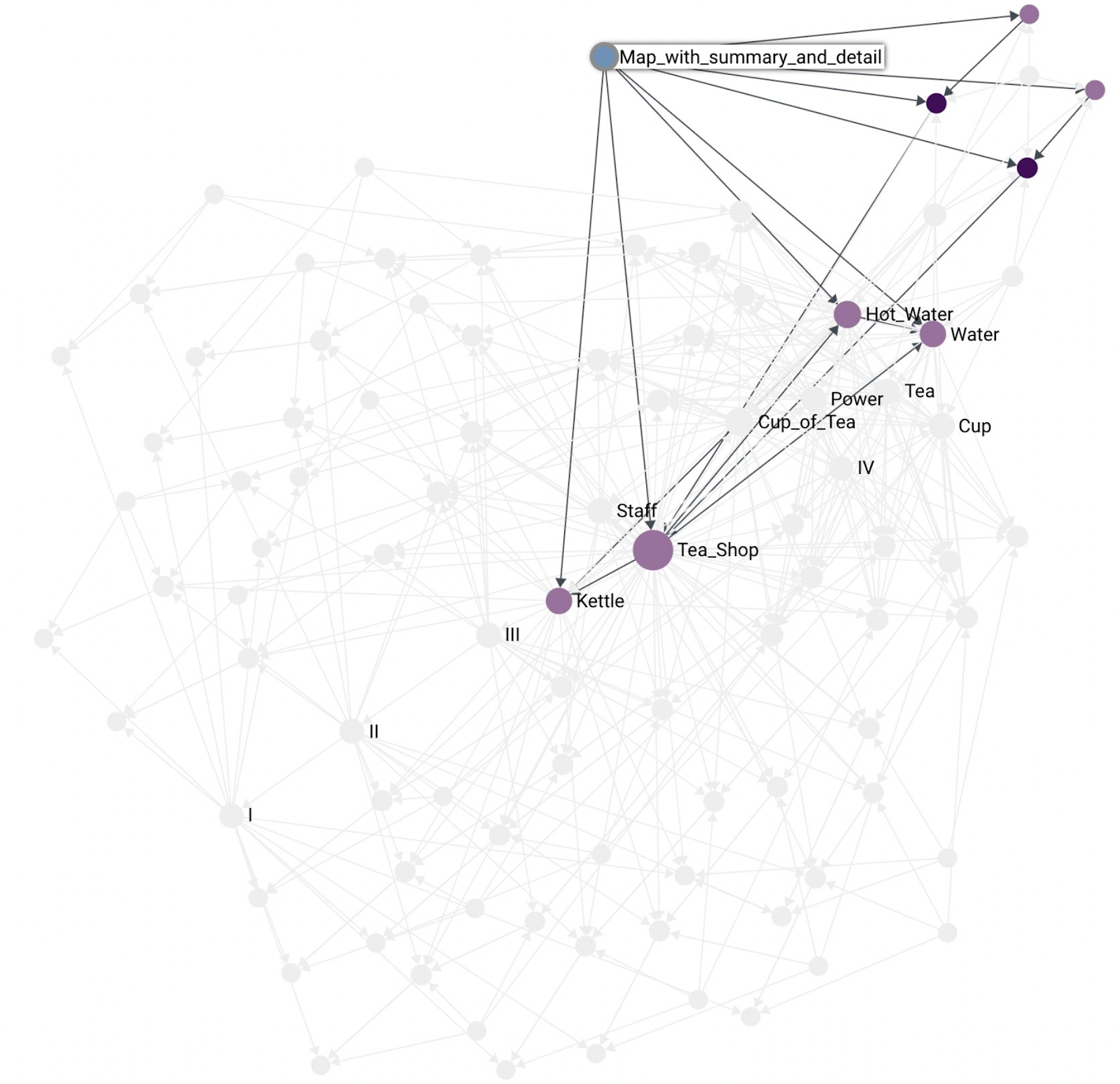
I think it is worth making the distinction between a map and a component that summarizes other components. That is, a map is not a summary component. A map does not contain other maps. A map simply contains the components, customers, and user needs that are depicted on the map:
Another, example of a smaller map containing fewer components:
As mentioned before, a map is not the same as a summary component. Here is an example of a map that contains the Tea Shop summary component as part of the map:
With maps and components being distinct from each other we end up with a representation where maps can have both, the summary component and at the same time highlight some of that component’s constituents. For example, the kettle situation in the Tea Shop:
What’s Next?
The above is what I’ve been able to put together so far in my exploration of embedding Wardley Maps in non-Euclidean semantic spacetime. I hope you enjoyed the journey and see Wardley Maps from a new perspective. I very much recognize the irony of promoting a graph to represent a map, but I hope I made the context clear for when to use a graph (machine representation) and when to use a map (human interface).
As a tool builder, I find this graph representation very compelling and sympathetic to the problems I encountered when attempting to create a useful machine representation. I hope that by sharing it with you we can improve the capabilities of our tools and perhaps this could become a useful common foundation for a common interface/representation between our various systems.
To learn more about semantic spacetime and the underlying foundation for the whole graph thing I recommend Mark Burgess’ series: Universal Data Analytics as Semantic Spacetime. After going through Marks’ material, I adapted his SST library (https://github.com/markburgess/SemanticSpaceTime) into a format more familiar to me, resulting in my version of the sst library (https://github.com/tristanls/sst). These establish the semantic spacetime foundation on which Wardley Graph is built.
For the Wardley Graph implementation itself, my experimental library is https://github.com/tristanls/wardleygraph, where you can see semantic spacetime concepts adapted specifically for the Wardley Graph use case. Additionally, that’s where you’ll find reference implementation of the summary algorithm and examples of how to encode the information contained in a Wardley Map into a graph.
There is plenty more to do and learn. Graph machine learning comes to mind. What would scenario planning look like on a Wardley Graph? Can I subscribe to components maintained by experts? Does a graph make it easier? The current implementation uses ArangoDB as the graph database, I intend to explore using Amazon Neptune next. I hope you find the graph representation as compelling as I do, and I look forward to seeing what the Wardley Mapping community can do with it.
1 Burgess, Mark. Smart Spacetime: How information challenges our ideas about space, time, and process (Kindle Location 6668). Kindle Edition.
2 Wardley, Simon. Wardley Mapping Book, Chapter 2: Finding a Path, accessed on 4 Jan 2022.
3 Slominski, Tristan. Obsolescence Climactic[sic] Pattern: When Things Move to the Left, accessed on 4 Jan 2022.
4 Burgess, Mark. Respecting the graph directly, accessed on 4 Jan 2022.
Wardley Maps and a Thousand Brains
Why Maps Are Effective Tools

I made a claim on Twitter recently that Jeff Hawkins’ new book: “A Thousand Brains: A New Theory of Intelligence”, explains why a map is an effective tool for the human brain.
Reference Frames
The key insight of the Thousand Brains theory is that the primary purpose of the neocortex is to process reference frames.
Each column in the neocortex—whether it represents visual input, tactile input, auditory input, language, or high-level thought—must have neurons that represent reference frames and locations.
Up to that point, most neuroscientists, including me, thought that the neocortex primarily processed sensory input. What I realized that day is that we need to think of the neocortex as primarily processing reference frames. Most of the circuitry is there to create reference frames and track locations. Sensory input is of course essential. As I will explain in coming chapters, the brain builds models of the world by associating sensory input with locations in reference frames.
Hawkins, Jeff. A Thousand Brains (p. 50). Basic Books. Kindle Edition.
Recall that a reference frame is like the grid of a map.
Hawkins, (p. 59).
This has implications for what thinking actually is. All knowledge is stored in reference frames and thinking is a form of moving.
The hypothesis I explore in this chapter is that the brain arranges all knowledge using reference frames, and that thinking is a form of moving. Thinking occurs when we activate successive locations in reference frames.
Hawkins, (p. 71)
If everything we know is stored in reference frames, then to recall stored knowledge we have to activate the appropriate locations in the appropriate reference frames. Thinking occurs when the neurons invoke location after location in a reference frame, bringing to mind what was stored in each location. The succession of thoughts that we experience when thinking is analogous to the (…) succession of things we see when we walk about a town.
Hawkins, (p. 73)
The process of thinking is described as movement on a map!
Maps
Simon Wardley articulates exactly what is needed for an abstract map. He captures the map’s essence.
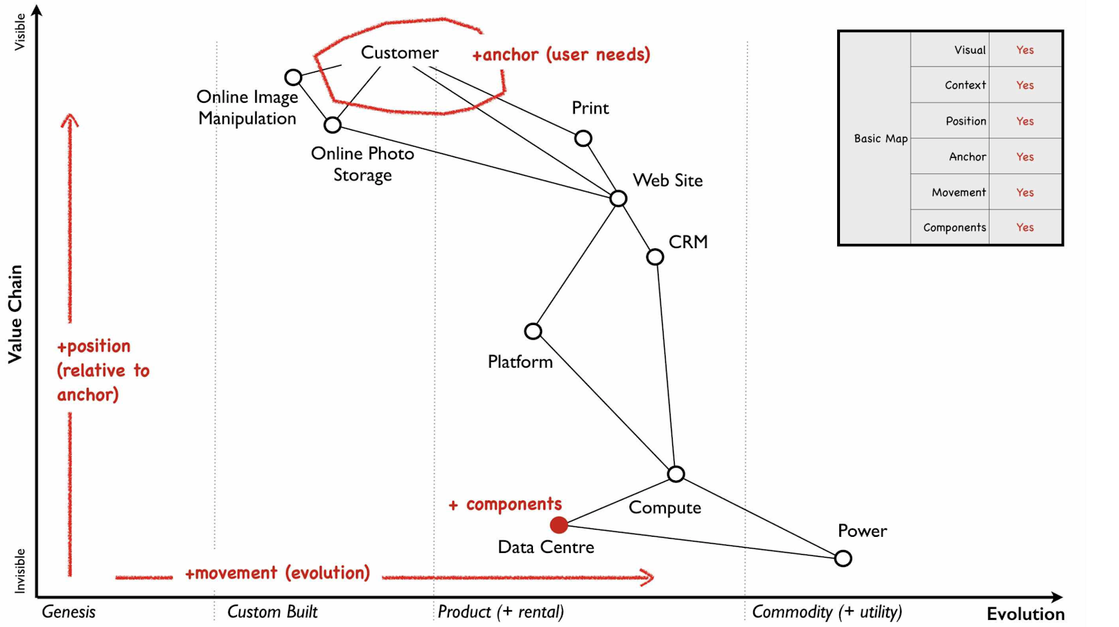
Maps are visual and context specific. The position of components has meaning based on the anchor. There is movement.1
To be an expert in any domain requires having a good reference frame, a good map.
Hawkins, (p. 87)
I believe that the reason why Wardley Maps are effective is that they are a reference frame for business. They are effective because they are in a form which allows our brains to think most naturally. They also happen to be a useful reference frame.
Beyond Wardley Maps
The reason for my excited tweet was a realization that Simon Wardley’s criteria of what makes something a map can be translated into a criteria of what makes something a good tool for our human brain.
We have a clear set of constraints for creating really useful tools for the mind!
What Do You Think?
Did you already know how to make useful mind tools, what was your approach? Let me know in the comments.
1 Simon Wardley. Chapter 2: Finding a path. https://medium.com/wardleymaps/finding-a-path-cdb1249078c0. Accessed on 5 Mar 2021.
Microdoctrine: Wardley Doctrine Piece by Piece
Wardley Doctrine is a doctrine developed by Simon Wardley within Wardley Mapping.
“Doctrine are the basic universal principles that are applicable to all industries regardless of the landscape and its context.”
https://medium.com/wardleymaps/doctrine-8bb0015688e5
There is a lot of doctrine. It consists of 44 principles, many of which are entire topics onto themselves. Many writings on doctrine exist. Simon provided these under the Creative Commons Attribution-ShareAlike 4.0 International License. There are many ways to learn doctrine.
I wanted to experiment with the structure of doctrine. I hoped that I could structure it to make it easier to learn and adopt. I want to be able to assess my level of doctrine adoption. And, if I am adopting doctrine, I want to know what I should adopt next. With these goals in mind, I set out to create a doctrine format that breaks up doctrine into small pieces. I call this microdoctrine.
Microdoctrine takes inspiration from a pattern language. It organizes around the principles outlined by Simon. It breaks up those principles into specific practices for individual learning. For example:
Phase: Stop Self Harm
Category: Development
Principle: Focus On User Needs
Practice: Examine Transactions

Motivation:
Any value we create is through meeting the needs of others. A mantra of “not sucking as much as the competitors” is not acceptable. We must be the best we can be.

Consider these first:
Know Your Users

Illustrative description:
Look at the transactions that an organisation makes with the outside world. Examine the customer journey when interacting with those transactions.

Detailed description:
Look at the transactions that an organisation makes with the outside world. This will tend to give you an idea of what it provides and what is important. Next, examine the customer journey when interacting with those transactions. Question this journey and talk with customers. You will often find pointless steps or unmet needs or unnecessary needs.

Another mechanism, if you adopted Wardley Mapping, is to map out the user’s landscape. By mapping out their landscape, you can often clarify what the user needs. You can also find entire new opportunities for business.

STOP READING, TAKE ACTION
Consider next:Align Value Generation With User Needs or Consider Stage of Evolution
“Consider these first” and “Consider next” links express sequencing. This is to answer what principle to adopt next. This also intends to provide immediate benefit. At the same time, it intends to build up ability to adopt future practices.
I completed the first nine doctrine principles in microdoctrine format. These make up Phase I: Stop Self Harm. They are all listed on the Wardley Mapping community site. The starting place is Phase I : Development : Know Your Users.
I can imagine us, doctrine practitioners, organizing around the microdoctrine structure. Each of us could contribute our specific expertise. For example, Phase I : Communication : Challenge Assumptions practices all deal with Spend Control. An expert on Cynefin could contribute a Phase I : Communication : Challenge Assumptions : Ritual Dissent practice for us to consider. My hope is that microdoctrine provides minimal scaffolding for us to organize around.
What do you think? Is this structure useful for learning or assessing doctrine? Are the existing patterns valid? Do you want to add patterns you know about?
Introducing Phase Line Mapping
TL;DR Phase Line Mapping is like Wardley Mapping, but at a smaller scale, the scale of projects or initiatives. Instead of the evolution axis, we have a phase line completion axis.
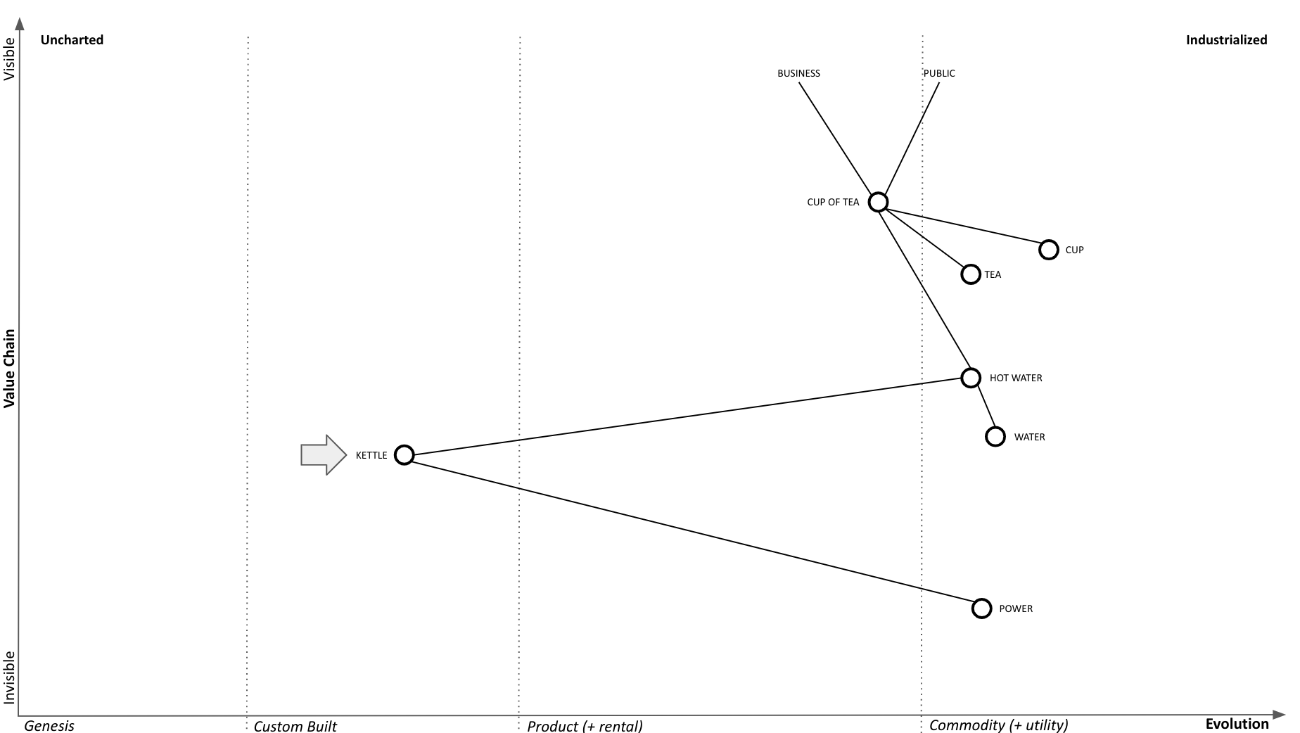
Phase Line Mapping attempts to bring topographical intelligence to project management, similarly as to how Wardley Mapping brought topographical intelligence to business strategy. Taking the classic tea shop Wardley Map, let’s assume we decided to replace the custom kettles we’re building with a supply of commodity kettles.
Phase Line Mapping
A phase line is a synchronization mechanism that is similar to a milestone but different from a due date. It depicts changes in the phase of an operation without using dates, therefore, making it possible to coordinate without coupling to the calendar.
Phase Line Mapping retains the value chain scaffolding as the y-axis, in order to keep the project anchored to the outcome it is supposed to provide, while substituting phase line completion axis for the evolution axis:

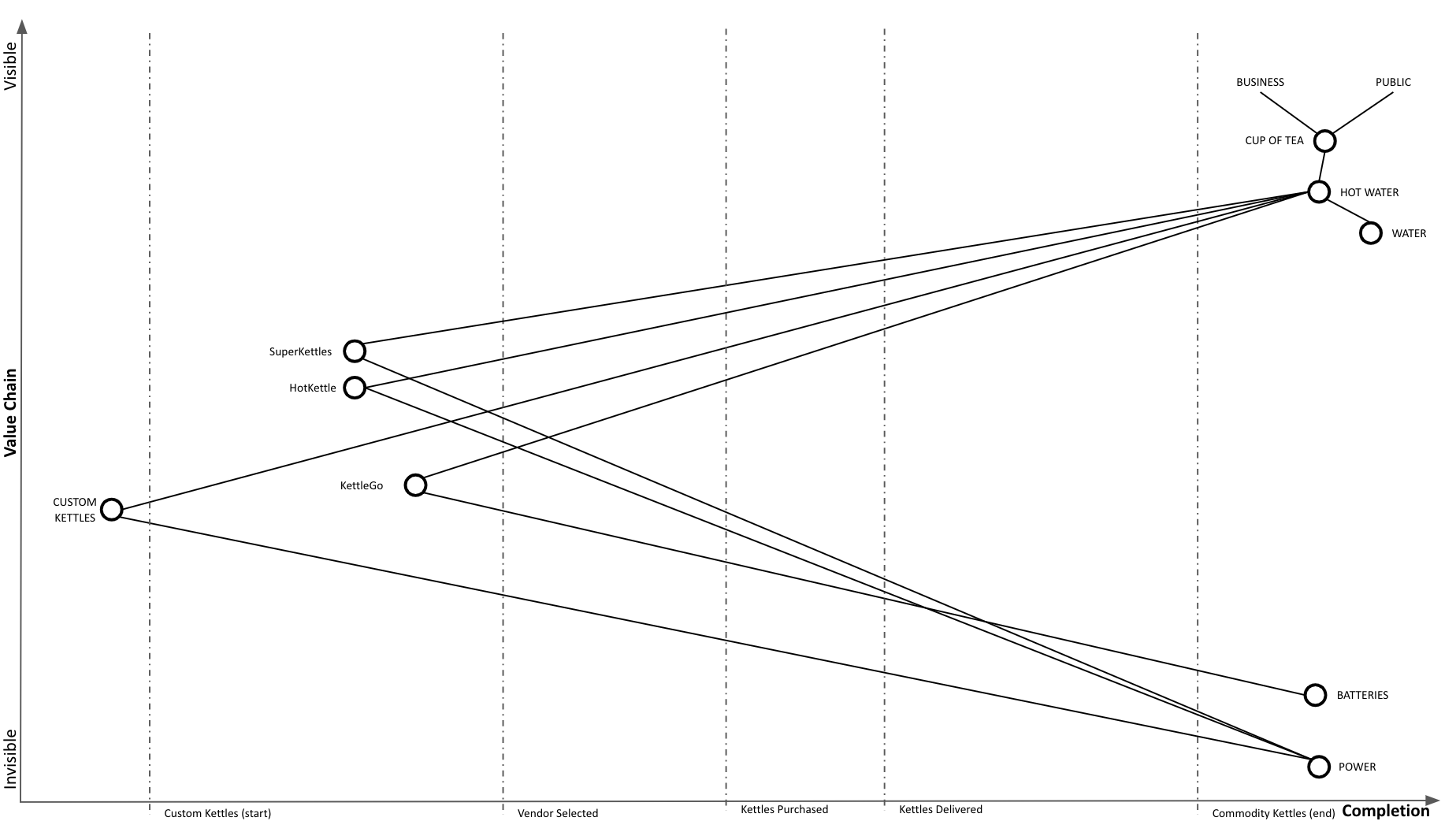
We conduct vendor selection by trying out a few vendors (SuperKettles, HotKettle, and battery powered KettleGo):
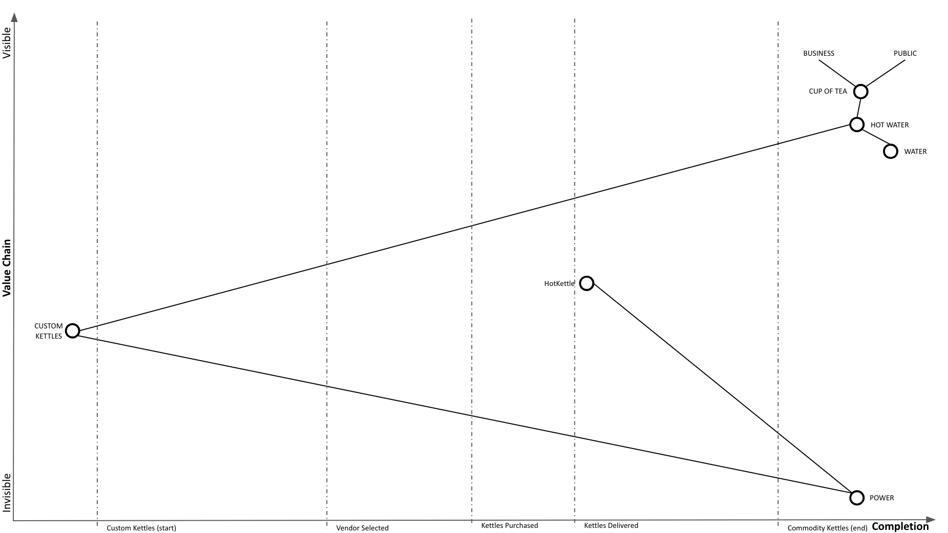
We determined that HotKettle has the right stuff and select them as our vendor. We go through the purchasing process. Notice that we continue to use our custom kettles throughout:

We are hitting some snags with purchasing, but we’re almost there:

Purchasing complete, awaiting delivery:

New HotKettle kettles delivered:
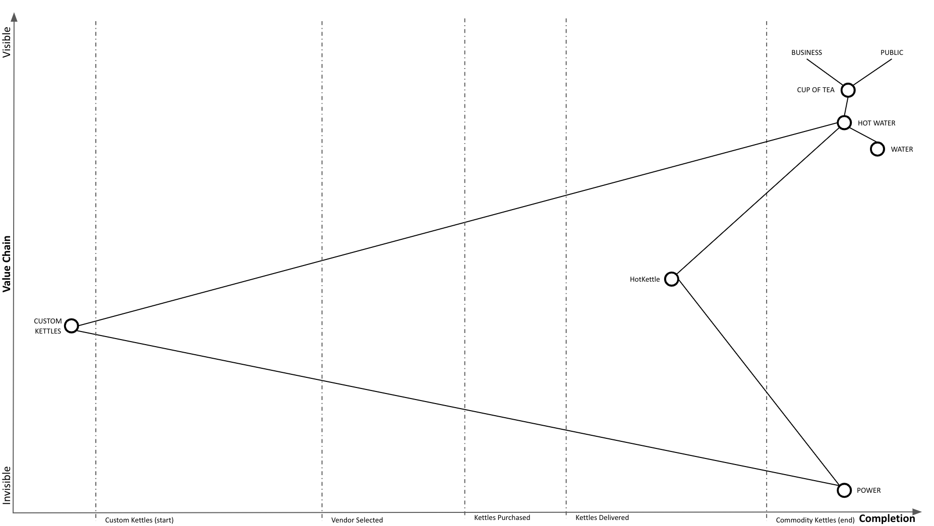
We started our replacement in-place process and are now using HotKettles as well as custom kettles:
Our adoption of HotKettles is complete:
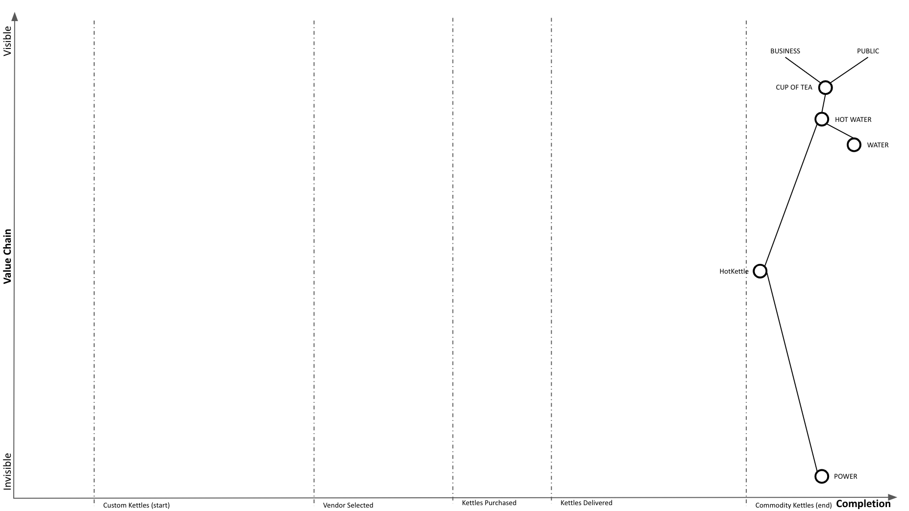
And at Wardley Mapping scale, we completed our transition to commodity:

Phase Line Mapping retains the required elements of a basic map. It is visual, context specific, position has meaning, it is anchored in user needs, movement is present (across phase lines, instead of evolution), and it has components.
Phase Line Mapping has at least two of the three elements of an advanced map. It demonstrates flow between components and can represent different types of things. I am uncertain about what the project level climate looks like or if a stable climate exists. That remains to be seen.
Why?
I have made multiple attempts to share Wardley Mapping. Wardley Maps were intuitive and obvious to me (once I saw them), due to my life experience with topographical maps. However, my experience is not a shared context, and I found it difficult to communicate the value to someone who didn’t immediately “get it”.
The thinking with Phase Line Mapping is that many organizations are executing many projects and programs and are communicating progress in multiple custom ways. Phase Line Mapping is yet another (custom) way to demonstrate project progress across milestones. However, the hope here is to demonstrate mapping that is coherent with Wardley Mapping (same elements, things still move to the right), but where the feedback cycle is much quicker than your typical Wardley Map time scale. It can take years for things to move on a Wardley Map. By introducing a phase line axis, we can generate more feedback loops quicker while training people in Wardley Map intuitions.
My hope is that by being able to demonstrate Phase Line Mapping more broadly in projects, perhaps then, it will be easier to introduce a Wardley Map by saying: it’s like Phase Line Mapping, but at a larger scale, the scale of business. Instead of the phase line completion axis, we have an evolution axis.
